Skills Builder
Using data to drive rapid iterations in design
Background
In September 2021, we launched a feature intended to guide learners who have access through their company, school, or organization to courses that can help them reach their goals. We didn't see the desired uptick in course enrollments, indicating that the feature we launch wasn't helping learners find the right courses. The Product Manager and I partnered together to investigate and make updates to the experience.
Version 1
I had worked on the original designs for this feature. We'd wanted to fit this within the current experience and use existing components from our design system.
In this design, users were asked to incrementally provide information to us, and promised a set of recommendations at the end of the experience
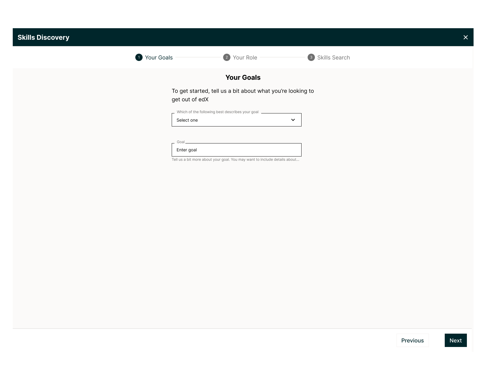
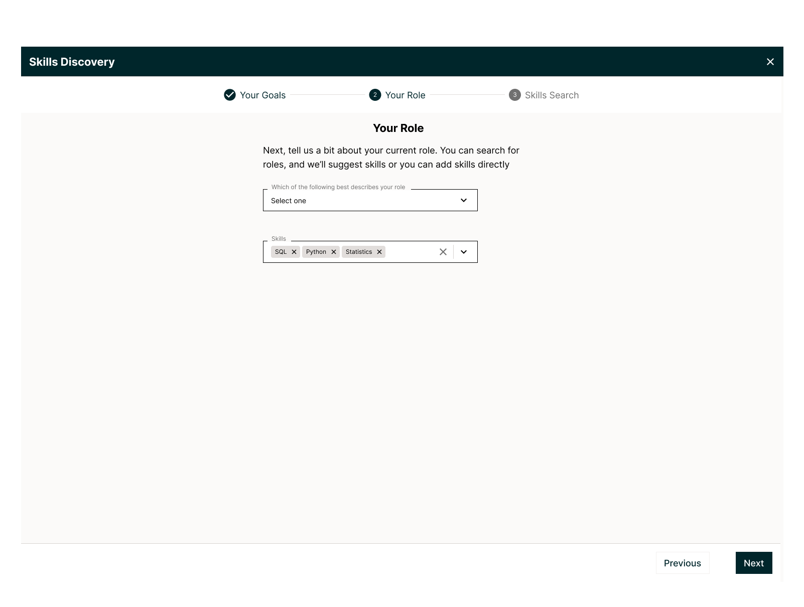
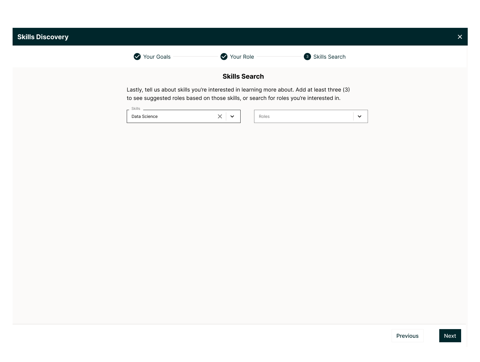
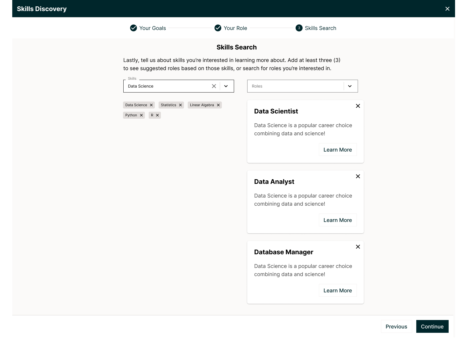
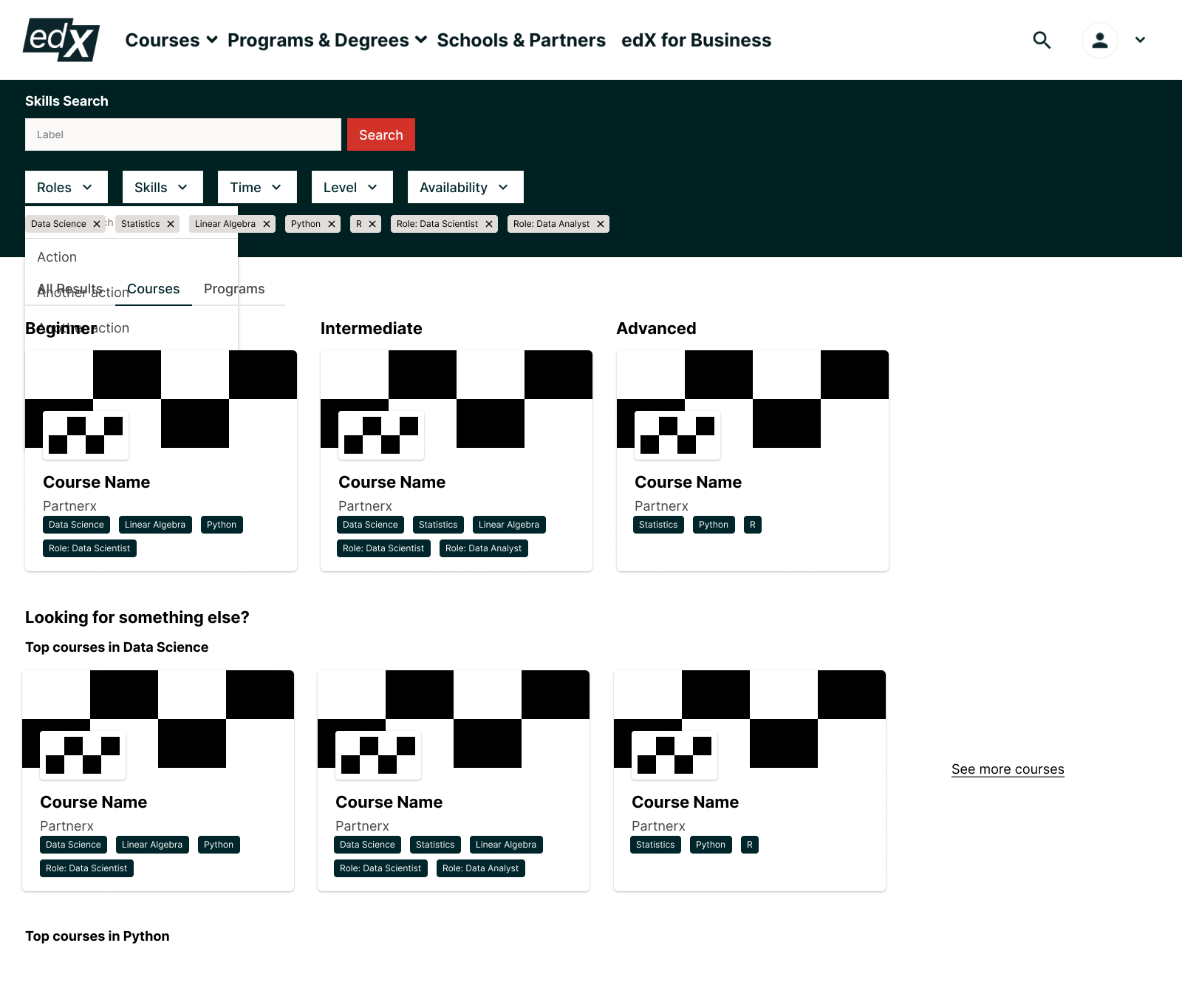
Even though we were seeing a trend in our enrollment data, compared to learners that didn't go through this experience, we wanted to understand why. We quickly stood up a HotJar intercept survey to ask learners what they thought of the experience.
As a result, we heard a few key themes:
1) We had a set of learners who identified as students and didn't see a clear option under "current role". This left them a bit confused as to how to proceed, since it also wasn't clear if this field was required or optional.
2) Overall, learners had a fairly neutral opinion of how effective the tool was in helping them find a course.
Lastly, we found that our funnel was leaky at the top, meaning that users who made it through to the course recommendations had a higher conversion rate, but a small percentage of users made it that far.
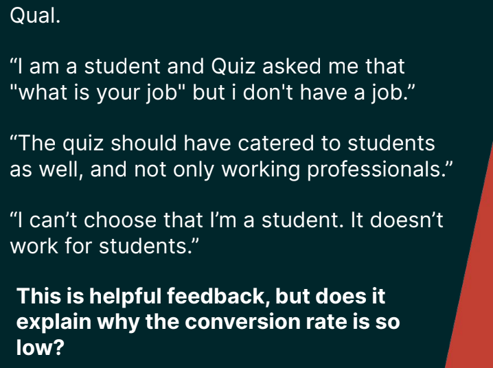
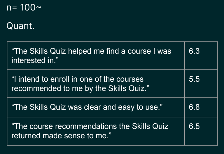
We made a plan to simplify the design based on some of this feedback. For the new design I:
● Updated copy to better reflect what the tool was intended to accomplish
● Added visual branding through using brand shape and imagery in line with brand guidelines
● Collapsed the experience from spreading across multiple steps to being on a single step
Version 2 Results
With new designs reviewed by developers, we continued to monitor both qualitative and quantitative feedback channels to see our expected increase in conversion for learners.
After launch, we started to see a small improvement over our original target metric (baseline conversion, in Blue below)
Continuing momentum
After launching V2, we weren't finished. I still needed to resolve the issue that students were facing. Since we planned on some additional work, I collaborated with colleagues in sales and marketing to include additional updates to copy, imagery, and branding.
I included a checkbox specifically for learners who identified as students, giving them a clear option to leverage this tool to propel their search. Because there were only 2 steps (inputs and review outputs) I removed the bulky, disruptive "progress stepper" and replaced it with an updated header that included brand imagery, our logo, and even some of our accent colors in the text.
Version 3 with copy and imagery updates
Final Outcomes
After synthesizing launching V3, we saw the conversion rate for the skills builder beat out not only the baseline search experience, but also the skill-enhanced search experience.